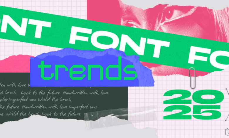
How to Find Creative Fonts Trending in 2025

In visual design, typography is more than just “what letter shape you pick, it defines tone, hierarchy, brand identity, and the emotional impact of your message. As we head into 2025, designers are increasingly seeking creative fonts, those that push boundaries, combine utility and expressiveness, and support flexibility (e.g. variable axes). But how do you spot which creative font styles are trending and ensure your choice is both fresh and functional? Below are strategies and signals to guide you.
Start with curated foundries and font libraries
One of the fastest ways to tap into cutting-edge typography trends is to browse respected foundries and curated font libraries. For instance, TypeType maintains a dedicated “Creative” font category on its site, which aggregates both well-made and technically optimized typefaces with distinctive or artistic character.
By exploring a category like TypeType’s Creative fonts, you can see what styles they consider “creative”display, script, decorative, experimental, hybrid, etc. Because these foundries often commission or surface new releases first, your exposure becomes a filter for what’s current.
Tip: Bookmark and regularly revisit foundries’ “new fonts,” “creative,” or “experimental” categories. Over time, patterns will emerge in color, contrast, modulation, or form.
See also: Understanding Mortgages: A Guide for Homebuyers
Watch the rise of variable and parametric fonts
A major trend in typography, especially for creative use, is variable fonts (fonts that allow manipulation along axes such as weight, width, slant, etc.). TypeType’s library already features 17 fonts with variable support across multiple axes.
Among their catalog, some fonts support three axes (weight, width, slant) such as TT Commons™ Pro, TT Lakes Neue, TT Octosquares, and TT Supermolot Neue. Others use two axes, or even one.
Why does this matter for creativity? Because you can fine-tune a font’s character to better fit layout constraints, transitions, or branding nuance. Instead of being stuck with a few masters (Light, Regular, Bold), you can generate intermediate designs that respond to context.
In 2025, fonts built with parametric design principles (where font properties are algorithmically defined) are gaining traction. These allow more fluid, dynamic, and responsive typography.
Follow design trend reports and creative communities
Fonts rarely trend in isolation, they follow broader design fashions: maximalism, minimalist elegance, brutalist layouts, retro futurism, glitch effects, etc. Keep an eye on:
- Annual design trend reports (from agencies, UI/UX blogs, graphic design magazines)
- Typography-focused blogs and foundry newsletters (e.g. TypeType blog, Fontsmith, Monotype)
- Social platforms (Behance, Dribbble, Instagram) — observe what novel typography styles are being used in posters, branding, or motion design
- Conferences and awards: the entries selected in typography awards (e.g. Granshan, Type Directors Club) often indicate boundary-pushing work
Evaluate technical features, not just aesthetics
Creative fonts must also work across media (web, print, motion). When assessing a candidate font, check for:
- OpenType / stylistic sets / alternates / ligatures — these “hidden capabilities” let you tweak letterforms, turn on decorative alternatives, or adjust character features to your layout needs
- Hinting / quality rendering — necessary for tight sizes or older screens
- Multilingual and script coverage — especially if your project crosses languages
- Licensing and usage flexibility — ensure the font is usable for your intended medium (web license, desktop, embedding
Use comparative sampling and prototyping
Once you have 5–10 promising creative fonts, test them in context:
- Mock up your design (poster, hero text, app splash)
- Compare several options side by side
- Tweak weight, width, or alternates (if available)
- Ask for critique from peers, typography is subjective, and extra eyes help
- Track which get attention or feel more “alive” in prototypes
Stay adaptive, refresh your font library regularly
What’s trending in 2025 may feel dated by 2028. To stay ahead:
- Subscribe to font foundry newsletters and release alerts
- Maintain a “watchlist” of creative releases to revisit
- Reassess your go-to fonts every year: which still feel fresh? Which feel overused?
- Don’t be afraid to commission custom type or tweak existing ones, your best creative font might be one you adapt
Conclusion
In 2025, creative fonts are shaped by a balance between expressive novelty and typographic utility. By exploring curated collections (like TypeType’s Creative category), leveraging variable/parametric technologies, monitoring design signals, and rigorously testing candidate fonts, you can reliably find typography that is on trend and functional.


